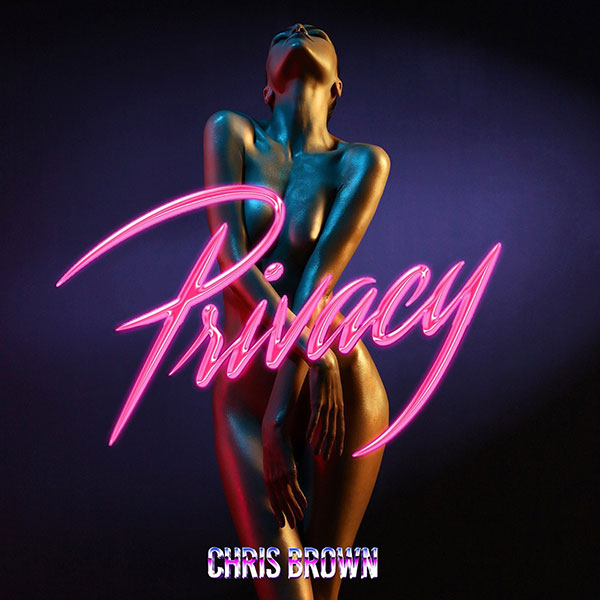
To do the text I duplicated the "Dreams" text and just changed the word so it remained the same formatting.
As for the image I just adjusted the opacity and the brightness as well as adjusting slightly the highlights in the image.


 For this panels I kept the colour theme of purple and made sure it featured the neon light by using the same image for the disc that can be found on the front panel. As this disc panel doesn't feature one of the Gods Own Junkyard photos, linking the RAINA text and the disc using the image helped link it and make it flow better with the rest of the digipak.
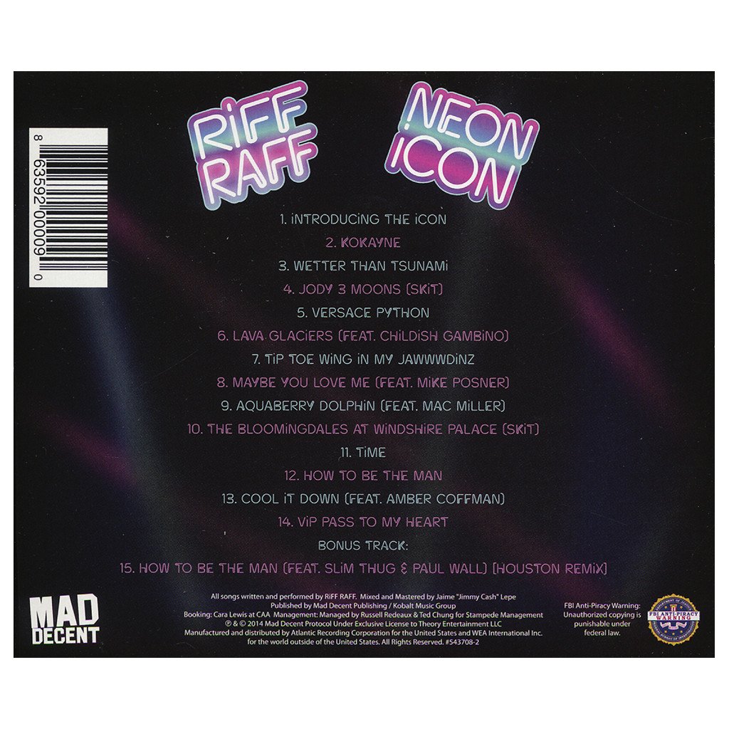
  For the track list I wanted it to be quite simple however I still wanted it to hold that same neon theme featuring the colour purple. I decided to use a black background to keep it simple but to add in a few things to bring in that neon purple theme.
 For the neon light palm tree I also edited the luminosity of the light before placing it on the black background and then using the smudge and blur tools on photoshop I blended it into the background to make the glow seem a little more natural instead of being squared off at the corners and sides.
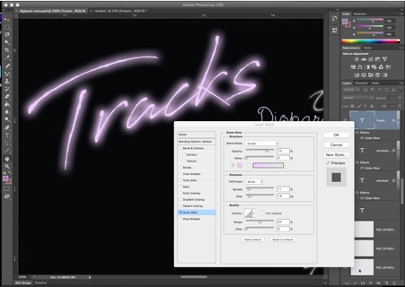 In terms of the text I wanted the text I wanted the writing to glow like the neon lights. To do this I edited the outer glow of the word, changing the opacity and noise level as well as the contour range and the spread of the element.